🚀 Ready to grow? Book your free 30 min call today
Apple’s new “Liquid Glass” design language is glossy, cohesive, and undeniably slick. In this week’s Front&Centre, we look at what Apple got right, where accessibility falls short, and what every business can learn about building trust through design.
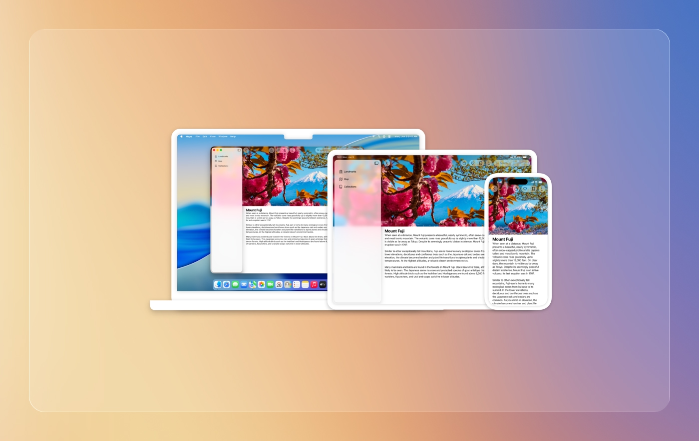
Apple has a habit of dropping design shifts that feel inevitable the second you see them. This year’s move is called Liquid Glass, a glossy, translucent, almost ethereal design language now woven through iOS 26, macOS Tahoe, and the rest of Apple’s ecosystem. It is the kind of update that feels instantly Apple: gradients, glow, transparency, and a smooth depth that makes old flat UI suddenly look tired. It looks great in a demo. It looks even better in a keynote montage with a Jonny Ive voiceover.
But Liquid Glass is not really about looks. It is about cohesion.
Apple’s move here is less about pretty buttons and more about making every interaction across devices feel like part of the same universe. Your phone, your laptop, your watch—they do not just talk to each other. They feel like each other.
And that is where the business lesson sits.
Let’s get this out of the way: design systems often get treated like homework. Most teams see them as rigid style guides or bloated Figma files no one wants to maintain.
But when they are done right, design systems are not about rules. They are about trust.
Apple has known this forever. From the moment you swipe up to unlock, to how Safari tabs animate, to the way notifications bounce in, it is all designed to feel consistent. You do not have to relearn behaviours every time you shift context. That invisible consistency builds comfort. And comfort builds trust.
It is why you do not hesitate to buy things with Apple Pay, or why you are comfortable sharing your entire photo library across devices. Cohesion is not a design nice-to-have. It is brand infrastructure.
For businesses, the parallel is obvious. If your website looks one way, your Instagram another, and your email campaigns like they were written by a totally different company, you are creating seams. And seams create friction.
Customers notice. Even if they cannot articulate it, they feel the mismatch. And once trust takes a hit, so does engagement.
Here is the flip side. Liquid Glass looks incredible, but it comes with baggage: accessibility trade-offs.
Translucent layers, blurred backgrounds, and glowing accents are not universally friendly.
Apple has answers, with system-wide accessibility settings like “Reduce Transparency,” “Increase Contrast,” and “Reduce Motion.” That is good. But here is the thing: those are fixes after the fact. The default design language is still optimised for beauty over legibility.
And that is a lesson in itself.
Accessibility cannot be an afterthought. It is not a toggle buried in Settings. It should be part of the design language from the start.
Think about your business. It is easy to chase the shiny parts of branding: new logos, flashy websites, social media campaigns dripping with personality. But if those things are not usable by everyone, you are shrinking your audience before they even get to know you.
Accessibility does not just help people with disabilities. It helps everyone.
What looks like design compromise is actually design maturity.
At Insitu, we see this all the time. Businesses come to us with mismatched brand assets, outdated websites, or inconsistent messaging. The fix is not just “make it pretty.” The fix is build a system.
It is not glamorous work. It is not a shiny keynote moment. But it is what makes a brand trustworthy.
Because here is the truth: people do not care if your website looks like Apple. They care if it feels like you. And if it feels the same every time they interact with you, trust compounds.
Cohesion gets a bad rap as limiting creativity. But Apple proves the opposite.
Within Liquid Glass, there is still room for delight: dynamic wallpapers, widget customisation, subtle haptics. Designers can play all they want, but the system holds it together.
That is the sweet spot. Creativity within boundaries. Playfulness without breaking trust.
It is the same for small businesses. A clear brand system does not stop you from trying a bold campaign, launching a new product, or testing a fresh design direction. It gives you the rails so those experiments do not derail the experience.
So ask yourself: If a customer moves from your Instagram feed to your website, or from your email to your checkout flow, does it feel like the same brand?
If not, you have an opportunity.
Because customers do not see “channels.” They see you. And if you look different everywhere, they trust you less everywhere.
Apple’s Liquid Glass is a design flex. But it is also a reminder of two deeper truths:
Beautiful design is meaningless if it is not usable. And accessible design is meaningless if it is not consistent. You need both.
For businesses, that is the play: build systems that are fluid, inclusive, and unmistakably yours. Not just polished. Not just accessible. Both.
Because trust is not won with gradients and glow. It is won when people know, without hesitation, that they are in the right place.
Liquid Glass will wow in keynotes, but the real impact of any design system is quieter. It is in the comfort of knowing what to expect. The confidence that things will work the way they should. That is the invisible glue holding trust together. And whether you are Apple or a small business, that is the game worth playing.
